


By Rebecca Kemmerer
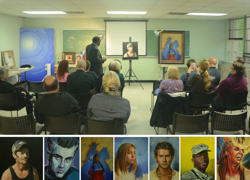
 On Tuesday, April 24, 2018, the Portrait Society of Atlanta held its semi-annual critique session at the Spruill Center for the Arts in Dunwoody. Lora Hill hosted the evening and Ernest Varner, a PSA Advisory Board member, served as our critic.
Always entertaining and informative, he brought some examples of his work that represented a progression of simple study to fully realized, large-format painting. Before addressing the work that was brought in, he offered some general thoughts (as he credited teachers and colleagues) such as:
• Your painting will never be any better than your ability to draw.
• Practice with simple shapes, such a cylinder or an apple, as the basis for human forms.
• When you start painting at the beginning of the day, first check your drawing. You’ll see problems when you are fresh.
• Work with a few colors before attempting the full palette. One of his studies used just burnt sienna, ultramarine blue, and white, yet had the appearance of a fully colored portrait.
• To check a possible correction, paint it on a piece of saran wrap first.
• Three members brought in paintings for comment. Ernest Varner was generous in his comments about what was working well in each piece, and offered suggestions for consideration such as:
• Don’t be reluctant to paint people of color, as there are more values in the skin to work with. Be careful to keep the skin in light fairly dark so it doesn’t get chalky. Cool browns are good in the shadows of dark skin.
• Very bright backgrounds are hard to use, as they detract attention from the main subject.
• Keep the shadows quiet, with little texture or suggestion of texture. Anywhere there is texture will draw the eye towards it, which may not be what you want.
• Be careful with lighter parts in the shadows, such as the whites of the eyes. They will be darker than you think.
• Address the accuracy of perspective for buildings and furniture in the background, but remember it is art, not a photograph.
• A brightly colored object will similarly pull attention away from the subject but can work if it is small and possibly not painted in great detail.
• Start a painting with an idea of what you are trying to accomplish. Don’t try to do everything all at once.
The evening included some general discussion among the audience and commentary by the artists who had brought in work. We all learned from the critiques of other artists’ work offered by an accomplished portrait artist.