

By Jean Ballew
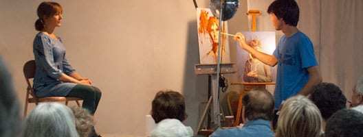
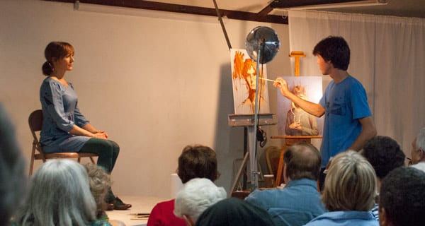
Using drawing and painting methods learned at Studio Incamminati with Nelson Shanks, Seth Haverkamp demonstrated some of his portrait painting techniques at the September meeting of the Portrait Society of Atlanta.
His 6’4” stature and youthful demeanor caught the attention of his audience, who remained captivated throughout the painting process. While adjusting the lights on his model (his wife Katherine) for the sitting and preparing his limited palette, he explained his evolution into a more creative artist.
 Haverkamp attended Cleveland Institute of Art and Memphis College of Art before earning his B.A. degree in painting from Carson-Newman College in Jefferson City, TN, in 2003. In those pre-Incamminati years, he meticulously produced perfect drawings and used tracing paper to transfer the detailed drawings to his canvas. Then, in the summer of 2004, he attended a Studio Incamminati workshop with acclaimed artist Nelson Shanks and never traced again. Haverkamp later studied with Robert Liberace, who had a great influence on him. With Liberace, he felt the freedom to develop his own methods and style as an artist.
Haverkamp has had numerous one man shows and creates interesting still-life paintings, but his chief subjects are his wife and children. In 2008, a portrait of his daughter, Echo, earned him best in show in the Portrait Society of America International Portrait competition.
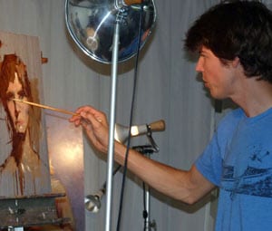
Haverkamp’s demonstration was done on hardboard toned with a value 5 mid-gray acrylic paint. He likes to use transparent brown oxide oil paint for drawing. The rest of his oil palette included cadmium orange, cadmium yellow light, permanent rose, permanent magenta, manganese violet, cobalt blue, dioxazine purple, and cremnitz (lead) white.
Within 2 minutes of starting his demo, there was a likeness, and in 20 minutes we saw an amazing portrait evolve. He continues to use the same principles whether executing paintings from life or photography. Using a #2 filbert bristle brush and thinned brown paint, Haverkamp made “scribbles” on his toned panel and smudged with paper towels until the eyes, nose, eye line, chin line, and top of hair were indicated. Using a #6 filbert to apply a mixture of white and cadmium orange, he warmed the forehead and nose bridge. Using other variations of orange, he refined the drawing. He selected one feature to be “the correct spot” and let every other feature evolve around it. He pushed and pulled color on the board and said he initially wants an “ugly” painting. As he builds the painting, he gets subtle changes with each pass, so he keeps it “ugly” as long as possible.
Haverkamp’s focus was on the different planes of the face, and he squinted often to see shapes. With paper towels, he wiped down to the gray ground for a 3-D effect and applied the lightest lights. He applied his darks (dioxazine purple and brown) and then warmed the tear duct. He finished the irises, shadows, and eye folds. He commented that with lots of paint on his board he could use it as a palette and scumbled the mixtures to define the forms. He placed the shadow under the nose, used his “iris” blue as a turning edge, and lifted other transitional areas.
 Asked about his multi-colored backgrounds, he said he begins by laying the board flat and splattering fluid washes of color on it with a 1” bristle brush. He allows the background to dry and then works on the subject the next day. He covers it with paper towels before flinging on more color for the background. Typically, he will apply about six layers of background colors, allowing a day to dry in between layers.
Haverkamp shared that his secret is that he is “not” a realist; he uses whatever color he wants to, disregarding some of the long-held views about warm light and cool shadow. He likes “brown” shadows. He uses cooler versions of the primaries and applies retouch varnish when a painting is done. He prefers hardboard to canvas because he likes to “fling” color. When asked about values, he said it was comparative. In the end, he said, the painting just has to look good. To see more of Seth Haverkamp’s work, visit http://sethhaverkamp.com